Redesigning a product navigation for engineers.
A former agency partner designed the product navigation [below] that is a typical UI pattern for a retail site, but wrong for engineering users.
Old Navigation Pattern
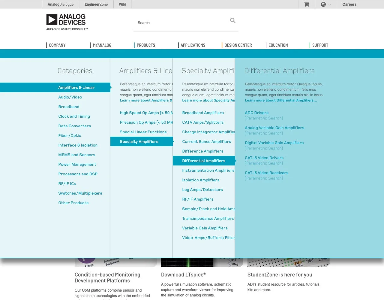
Feedback sessions alerted us to the frustrations our customers were having with the site product navigation.
Discovery learnings through interview sessions and online survey feedback:
A) Too many clicks to reach a final product selection table
Up to 6 clicks to reach a product 4 levels deep
B) Subcategory location confusion caused extra opening and closing of columns
Frustrated engineers would click back and forth reviewing different columns to ensure they weren’t missing a potential relevant subcategory option.
C) Repeat visitors experienced inefficient routine tasks
Return users didn’t have easy direct links to relevant categories or products.
Analog Devices
UX Director: Craig Garcia
ACD: Matt Woolhouse
UX Designer: Craig DuBois
Project Snapshot
3 Months
4 Languages
New Components
New Responsive Grid
New User History Integration
My team designed a bold new product navigation UI addressing the pain points.
Primary Goals:
• Reduce clicks to a product category
• Speed up time to final products
• Reduce confusion
Secondary Objectives:
• Increase overall awareness for subcategories
• Reduce time in menus
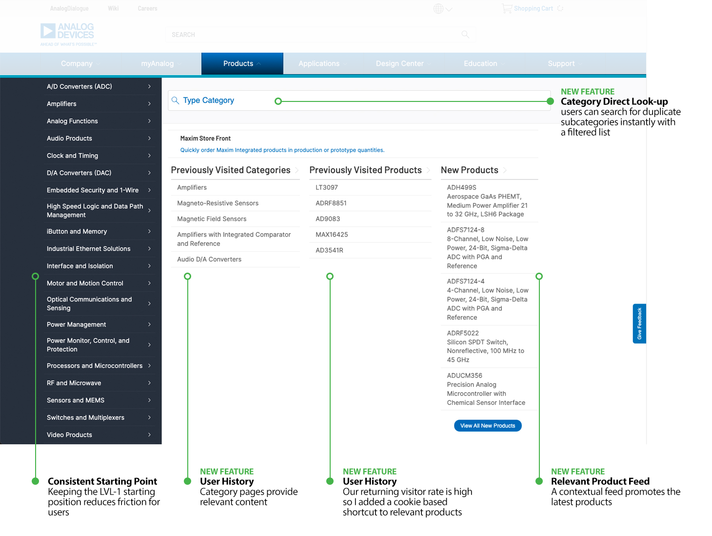
Advantages of new “Product UI” in default state:
Users could easily shortcut to their history of product and category selections
Used the default space on page better to provide “personalized” relevant options
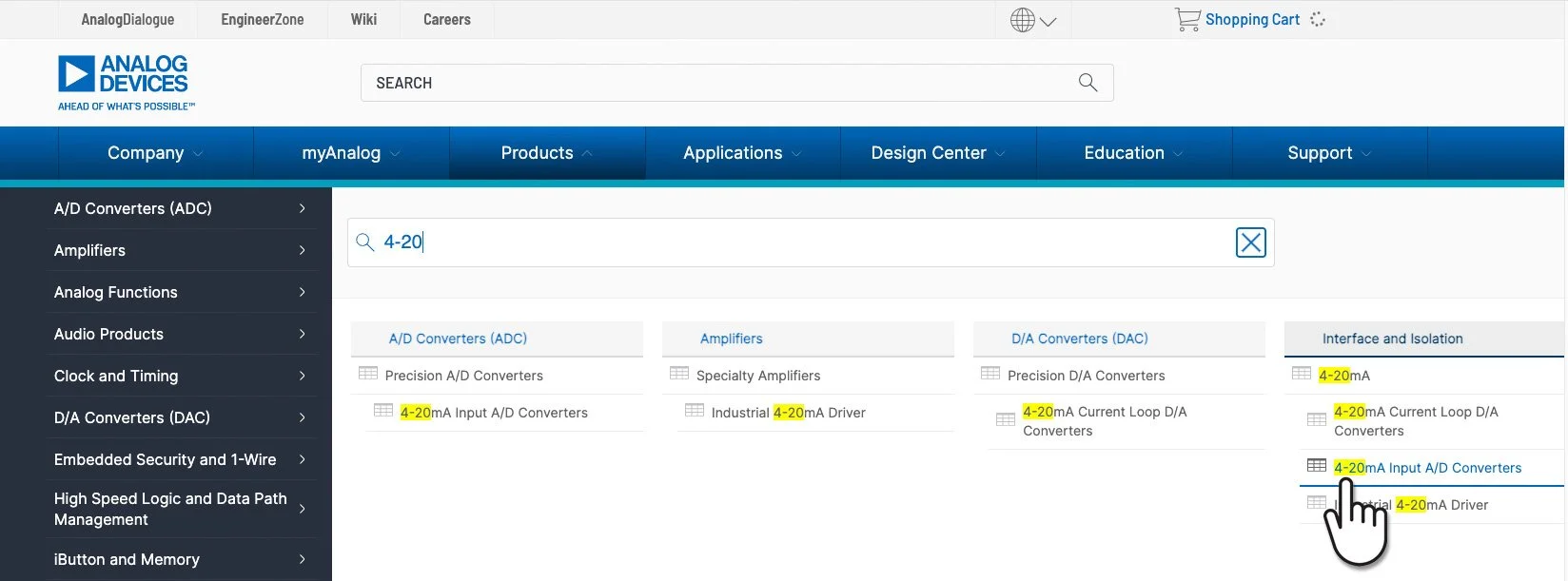
Search path UI advantages:
Users can type a category search query to instantly filter the entire product taxonomy …Eliminates the hunt
Users can click directly on a subcategory table icon to jump into a sortable product table …Saves time
Users can see the same subcategory option across multiple Level 1 paths. …Reduces confusion
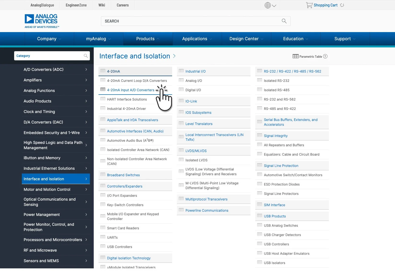
Clickable navigation path UI advantages:
Engineers are comfortable with data density allowing for the display of a multi-level taxonomy in one view
presenting all levels in one glance eliminates the need for back and forth column clicking
Level 1 product Navigation remains in recognizable place (reduces redesign friction)
Imitation is the highest form of flattery.
Our executives would often ask “What does Texas Instruments do?”. And I can say “Actually TI has copied our product listing page design… our home page design… and most recently they have copied our product Navigation UI design too!” The most essential and highly trafficked sections of a semiconductor site Texas Instruments copied from my team’s work at Analog Devices. These UI projects were all planned, designed and implemented by my team to replace legacy designs from our former agency partner.
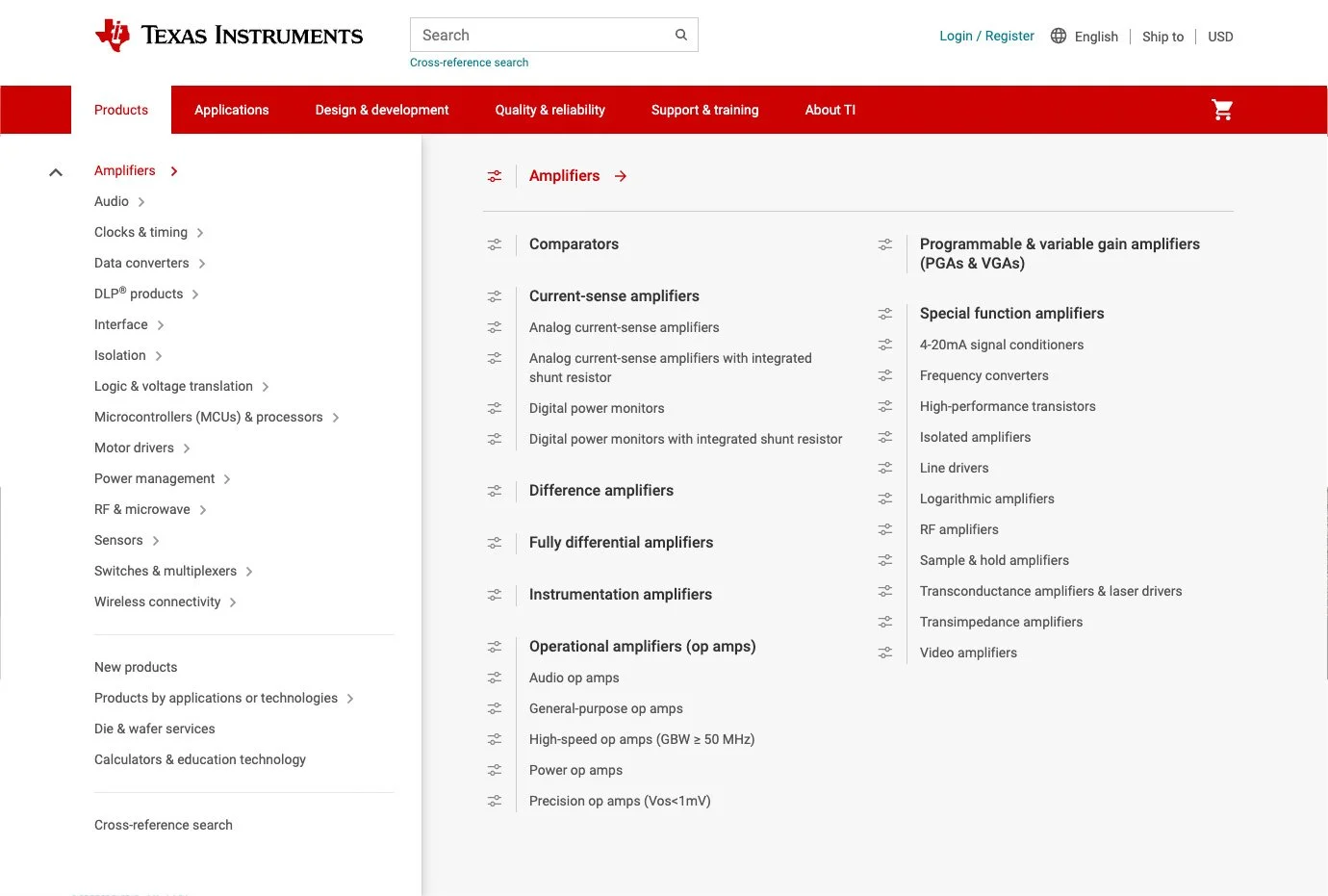
TI’s LVL-1 Product Navigation in 2021
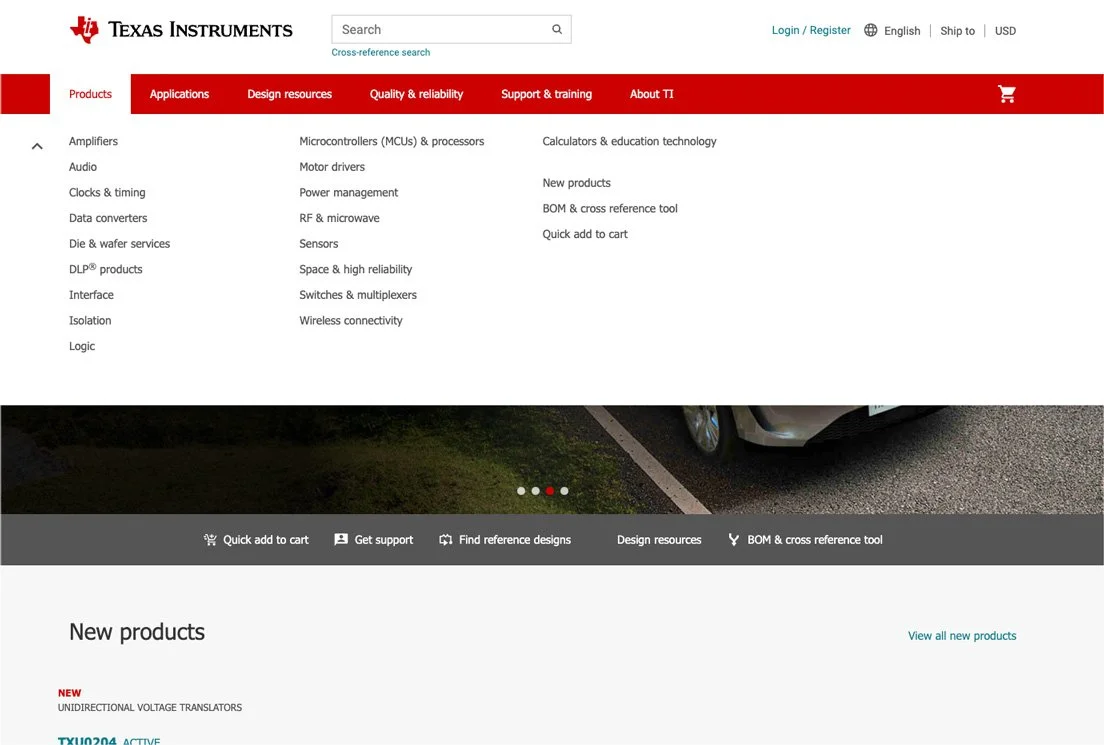
TI’s LVL-1 Product Navigation in 2022 (A copy of my team’s UI)